Data-Driven Organizations: Interactive Framework Visualizations
Role: Solo | Duration: Fall 2025 - First Semester | Focus: Business Intelligence, Organizational Analytics, Data Literacy
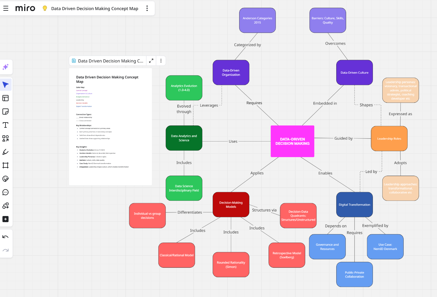
This project transformed academic research on organizational analytics maturity into interactive web-based visualizations that synthesize frameworks from Anderson (2015), Davenport (2018), McAfee & Brynjolfsson (2012), and other seminal works in data-driven decision-making. The application provides comprehensive exploration of why only 30% of organizations successfully transform to become data-driven despite documented performance advantages (5% higher productivity, 6% higher profitability).
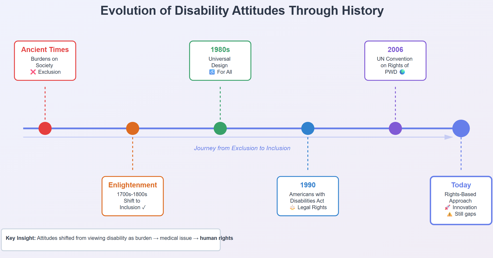
The implementation features five core modules: (1) Seven Key Characteristics radar chart visualizing Anderson's data democracy framework including strong leadership, open culture, self-service analytics, broad data literacy, goals-first orientation, questioning culture, and testing culture; (2) Analytics Evolution Timeline presenting Davenport's four eras from traditional business intelligence (Analytics 1.0) through big data (2.0) and mixed data types (3.0) to embedded AI (4.0); (3) Performance Impact comparative analysis showing data-driven organizations' advantage in productivity, profitability, return on assets, and market value; (4) Implementation Barriers breakdown of the three major obstacle categories (analytics-business disconnect, management issues, technical challenges) identified across MIT Sloan, TDWI, and Big Data Executive Surveys; (5) Decision-Data Quadrants framework mapping how organizations should approach decisions based on decision structure and data type.
The Decision-Data Quadrants module represents original synthesis work, categorizing decision-making into four contexts: Structured Decision + Structured Data (inventory reordering, credit scoring—enables automation); Structured Decision + Unstructured Data (Delphi technique, content moderation—requires NLP/text analytics); Unstructured Decision + Structured Data (strategic acquisitions like Facebook/WhatsApp—human judgment despite metrics); Unstructured Decision + Unstructured Data (crisis management, innovation initiatives—highest complexity). Each quadrant includes appropriate tools (BI platforms, text analytics APIs, document management systems), real-world examples, and implications for knowledge management system design.
Technical implementation used Chart.js for interactive visualizations (radar charts, bar graphs, timeline representations), HTML5/CSS3 for responsive layout with accessibility considerations, and JavaScript for user interaction logic. The interface employs progressive disclosure principles—users navigate between modules via tabs, with each section providing layered information from high-level frameworks to detailed implementation considerations. Color coding and visual hierarchy guide users through complex organizational concepts.
The project contributes to data literacy by making academic frameworks accessible to practitioners, providing actionable insights on the five key features advanced knowledge management systems require (social interaction, cross-lingual support, integrative data linking, dynamic/agile handling, simple/understandable interfaces). It addresses the critical gap between analytics tool adoption and cultural transformation that causes 70% of organizations to fail at digital transformation.
Skills Demonstrated: JavaScript, Chart.js, HTML5, CSS3, data visualization, information architecture, UX design, technical research synthesis, business intelligence frameworks.
Details and the final work can be found here:
Category: masters portfolio
349 
0

Comments